
In the first post in Radar’s new “visualization deconstructed” series, I talked about how data visualization originated from cartography (which some now just call “mapping”). Cartography initially focused on mapping physical spaces, but at the end of the 20th century we created and discovered new spaces that were made possible by the Internet. By abstracting away the constraints of the physical space, social networks such as Facebook emerged and opened up new territories, where topology is primarily defined by the social fabric rather than physical space. But is this fabric completely de-correlated from the physical space?
Mapping Facebook’s friendships
Last December, Paul Butler, an intern on Facebook’s data infrastructure engineering team, posted a visualization that examined a subset of the relations between Facebook users. Users were positioned in their respective cities and arcs denoted friendships.
Paul extracted the data and started playing with it. As he put it:
Visualizing data is like photography. Instead of starting with a blank canvas, you manipulate the lens used to present the data from a certain angle.
There is definitely discovery involved in the process of creating a visualization, where by giving visual attributes to otherwise invisible data, you create a form for data to embody.

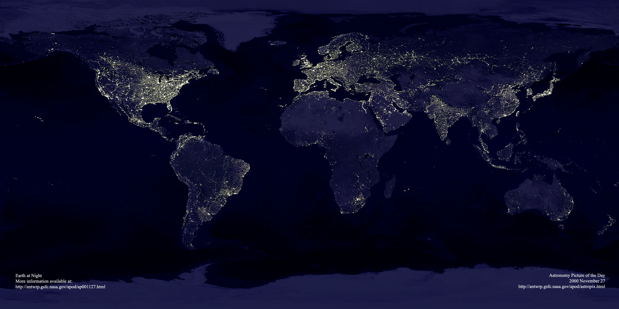
The most striking discovery that Paul made while creating his visualization was the unraveling of a very detailed map of the world, including the shapes of the continents (remember that only lines representing relationships are drawn).
If you compare the Facebook visualization with NASA’s world at night pictures, you can see how close the two maps are, except for Russia and parts of China. It seems that Facebook has a big growth opportunity in these regions!
So let’s have a look at Paul’s visualization:
- A complex network of arcs and lines does a great job communicating the notions of human activity and organic social fabric.
- The choice of color palette works very well, as it immediately make us think about night shots of earth, where the light of the city makes human activity visible. The color contrast is well balanced, so that we don’t see too much blurring or bleeding of colors.
- Choosing to draw only lines and arcs makes the visualization very interesting, as at first sight, we would think that the outlines of continents and the cities have been pre-drawn. Instead, they emerge from the drawing of arcs representing friendships between people in different cities, and we can make the interesting discovery of a possible correlation between physical location and social friendships on the Internet.
 Strata: Making Data Work, being held Feb. 1-3, 2011 in Santa Clara, Calif., will focus on the business and practice of data. The conference will provide three days of training, breakout sessions, and plenary discussions — along with an Executive Summit, a Sponsor Pavilion, and other events showcasing the new data ecosystem.
Overall, this is a great visualization that had a lot of success last December, being mentioned in numerous blogs and liked by more than 2,000 people on Facebook. However, I can see a couple ways to improve it and open up new possibilities:
- Play with the color scale — By using a less linear gradient as a color scale, or by using more than two colors, some other patterns may emerge. For instance, by using a clearer cut-off in the gradient, we could better see relations with a weight above a specific threshold. Also, using more than one color in the gradient might reveal the predominance of one color over another in specific regions. Again, it’s something to try, and we’ll probably lose some of the graphic appeal in favor of (perhaps) more insights into the data.
- Play with the drawing of the lines — Because the lines are spread all over the map, it’s a little difficult to identify “streams” of lines that all flow in the same direction. It would be interesting to draw the lines in three parts, where the middle part would be shared by many lines, creating “pipelines” of relationships from one region to another. Of course, this would require a lot of experimentation and it might not even be possible with the tools used to draw the visualization.
- Use a different reference to position cities — Cities in the visualization are positioned using their geographical position, but there are other ways they could be placed. For instance, we could position them on a grid, ordered by their population, or GDP. What kind of patterns and trends would emerge by changing this perspective ?
Static requires storytelling
In last week’s post, I looked at an interactive visualization, where users can explore the data and its different representations. With the Facebook data, we have a static visualization where we can only look, not touch — it’s like gazing at the stars.
Although a static visualization has the potential to evolve into an interactive visualization, I think creating a static image involves a little bit more care. Interactive visualizations can be used as exploration tools, but static visualizations need to present insight the data explorer had when creating the visualization. It has to tell a story to be interesting.
Related: